Why Web Friendly Script Fonts Are Important
When it comes to web friendly script fonts, selecting the right typeface is crucial for both aesthetics and functionality in web design. Script fonts that are web-friendly ensure your website looks appealing and remains accessible to all users across different devices and browsers.
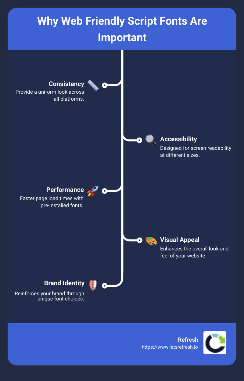
A quick answer to why this matters:
- Consistency: Web friendly script fonts provide a uniform look across all platforms.
- Accessibility: Designed for screen readability at different sizes.
- Performance: Faster page load times with pre-installed fonts.
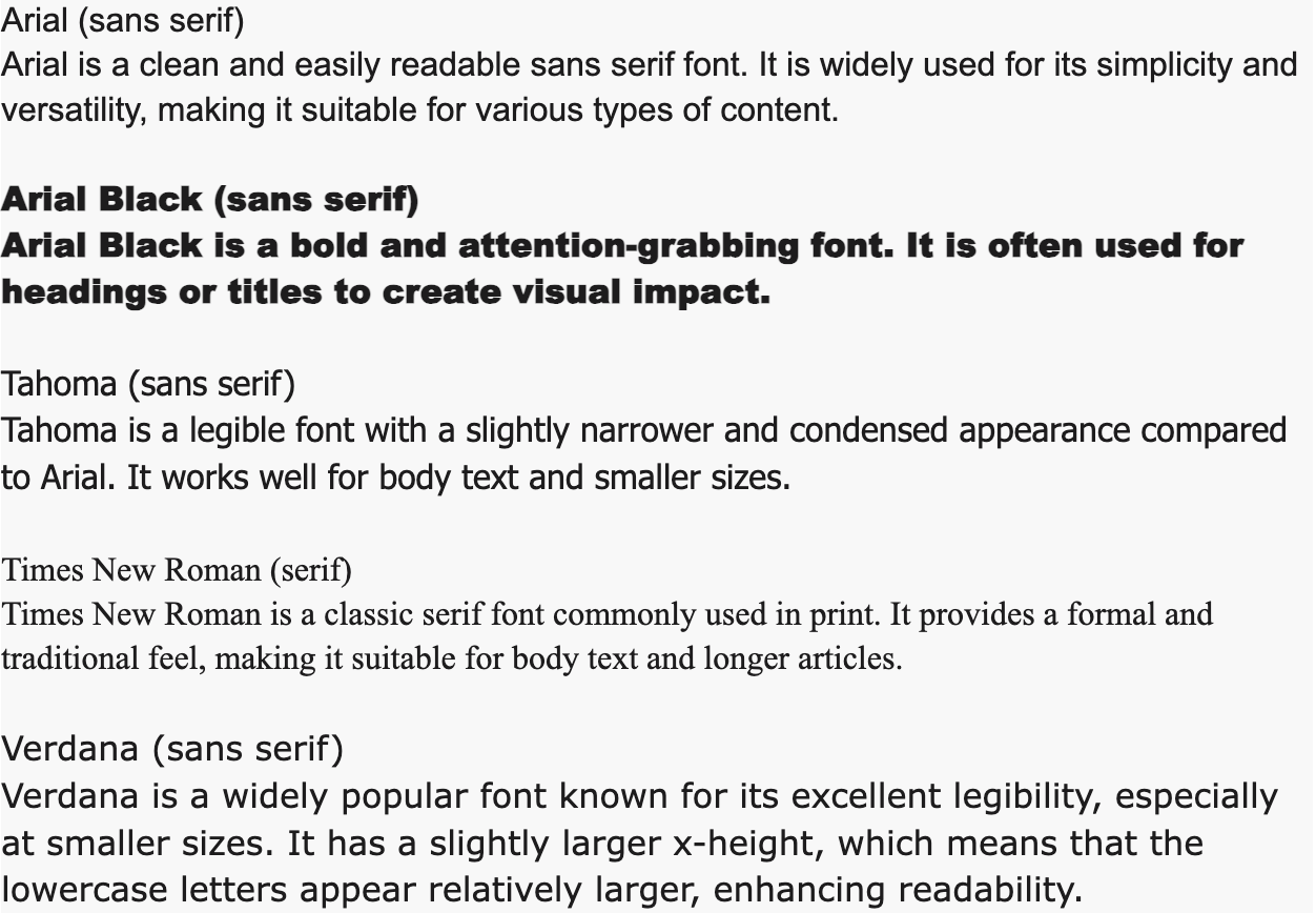
Web safe fonts like Arial, Helvetica, and Times New Roman are excellent choices for consistency. However, if you're looking to spice things up with a bit more flair, script fonts offer a unique way to stand out. These fonts not only improve the visual appeal of your site but also reinforce your brand identity.
I'm Alexander Palmiere, the Founder and CEO of Refresh Digital Strategy. With years of experience in developing and launching over 200 websites, I specialize in choosing the right web friendly script fonts to ensure both aesthetics and user accessibility. Next, let’s dive into what web friendly script fonts actually are and why they matter.
What Are Web Friendly Script Fonts?
Web friendly script fonts are fonts that look like handwriting or calligraphy and can be used on websites without worrying about compatibility issues. They are designed to work seamlessly across various browsers and devices, ensuring your website looks consistent and professional for all users.
Importance of Web Friendly Script Fonts
1. Consistency Across Devices: Web friendly script fonts are already installed on most operating systems, like Microsoft Windows or Apple MacOS. This means they will display correctly on almost any device, giving your website a consistent look.
2. Brand Reflection: Your font choice says a lot about your brand. For example, a casual script font like Bradley Hand can make your site feel more personal and approachable, while a more formal script like Allura can convey elegance and sophistication.
3. User Experience: Fonts that are easy to read and visually appealing improve the user experience. If your content is readable and looks good, visitors are more likely to stay on your site longer, which can lead to higher engagement and possibly more sales.
4. Performance and Speed: Web friendly script fonts are usually lightweight and load quickly, which is crucial for maintaining fast page speeds. Slow loading times can frustrate users and hurt your site's SEO.
Web Safe Fonts and Fallback Fonts
Web Safe Fonts: These are fonts pre-installed on most computers and devices. Using web safe fonts ensures that your text appears as intended, no matter what device or browser your visitor is using. Examples include Arial, Times New Roman, and Courier New.
Fallback Fonts: Even with web safe fonts, there is no guarantee that every font will work on every device. That's where fallback fonts come in. A fallback font provides an alternative if the primary font isn't available. For example, you could set your CSS to use "Brush Script MT" first, and if that’s not available, fall back to "Arial" or "sans-serif."
cssfont-family: 'Brush Script MT', Arial, sans-serif;
Using fallback fonts ensures that your website remains readable and visually appealing, even if the primary font fails to load. This small addition to your CSS can make a big difference in user experience.
By understanding what web friendly script fonts are and why they matter, you can make informed decisions that improve the look and functionality of your website. Next, let’s explore the top 10 web friendly script fonts for 2024.
Top 10 Web Friendly Script Fonts for 2024
Choosing the right web friendly script font can add a unique flair to your website. Here are the top 10 script fonts that will be trending in 2024:
1. Brush Script MT
Handwriting, neat, sophisticated
Brush Script MT is known for its neat, cursive style that mimics handwriting. It's sophisticated and works well for headings and decorative text.
Why choose Brush Script MT?- Sophisticated look- Easy to read- Versatile for various design elements
2. Bradley Hand
Casual, personal, headings
Bradley Hand brings a personal touch to your text. It's based on the designer Richard Bradley’s handwriting, making it perfect for headings and short bodies of text.
Why choose Bradley Hand?- Casual feel- Personal touch- Great for headings
3. Comic Sans MS
Playful, whimsical, easy to read
Comic Sans MS is a playful, whimsical script font that's easy to read. Despite its meme status, it can be a good choice for informal, fun content.
Why choose Comic Sans MS?- Playful and whimsical- Highly readable- Good for informal content
4. Lucida Handwriting
Humanist, clear, decorative
Lucida Handwriting offers a humanist touch with clear, decorative strokes. It's a great option for adding a bit of flair without compromising readability.
Why choose Lucida Handwriting?- Humanist style- Clear and decorative- Good for decorative text
5. Pacifico
Retro, cursive, friendly
Pacifico is a retro-inspired cursive font that's both friendly and approachable. It works well for branding and logos.
Why choose Pacifico?- Retro feel- Friendly appearance- Great for branding
6. Great Vibes
Calligraphy, neat, flowing
Great Vibes is a calligraphic script font that offers neat and flowing letters. It's perfect for neat and formal designs.
Why choose Great Vibes?- Neat calligraphy- Flowing letters- Ideal for formal designs
7. Dancing Script
Dynamic, casual, modern
Dancing Script is a dynamic and casual font that brings a modern touch to your web design. It’s perfect for creative projects.
Why choose Dancing Script?- Dynamic look- Casual style- Modern appeal
8. Allura
Clean, very readable, formal
Allura is a clean and very readable script font that’s great for formal contexts. It’s perfect for invitations and formal announcements.
Why choose Allura?- Clean design- Highly readable- Ideal for formal use
9. Satisfy
Vintage, cursive, stylish
Satisfy offers a vintage cursive style that’s both stylish and neat. It’s great for adding a touch of nostalgia to your design.
Why choose Satisfy?- Vintage charm- Stylish appearance- Good for nostalgic designs
10. Sacramento
Monoline, semi-connected, classic
Sacramento is a monoline script font with a semi-connected style, giving it a classic look. It’s perfect for timeless and neat designs.
Why choose Sacramento?- Classic look- Semi-connected style- Timeless elegance
Each of these web friendly script fonts offers unique characteristics that can improve your website's design. Next, we’ll dive into how to choose the best script font for your specific needs.
1. Brush Script MT
Brush Script MT is a classic script font that mimics the look of handwriting. Designed to be neat and sophisticated, it offers a unique blend of style and readability.
Handwriting
Brush Script MT was designed to look like it was written with a brush or calligraphy pen. This gives it a handwritten feel that's both personal and professional. When you want to add a human touch to your website, this font can be a great choice.
Neat
Despite its handwritten style, Brush Script MT maintains a neat appearance. The letters are well-formed and easy to read, making it suitable for various types of content. Whether you use it for headings or short paragraphs, it won’t compromise readability.
Sophisticated
Brush Script MT has a sophisticated look that can lift the design of your website. It’s not overly casual, making it versatile for different types of businesses. Whether you're running a blog, an e-commerce site, or a professional portfolio, this font can add a touch of elegance.
Why choose Brush Script MT?- Handwritten feel: Adds a personal touch- Neat appearance: Easy to read- Sophisticated look: Lifts your design
Choosing the right script font can significantly impact your website's look and feel. Now, let's explore the next font on our list: Bradley Hand.
2. Bradley Hand
Bradley Hand is a casual script font that brings a personal, handwritten touch to your web design. Imagine writing a quick note to a friend—that’s the vibe Bradley Hand gives off. It’s perfect for creating a warm and inviting atmosphere on your site.
Why Use Bradley Hand?
1. Casual and Relaxed Feel
Bradley Hand is not too formal, making it ideal for websites that want to convey a laid-back and approachable tone. Think lifestyle blogs, personal portfolios, or creative projects. It’s like having a friendly conversation with your audience.
2. Personal Touch
This font mimics natural handwriting, adding a personal and authentic touch to your text. It’s great for sections where you want to connect with your audience on a more personal level, like an "About Me" page or personal anecdotes.
3. Ideal for Headings
While Bradley Hand is versatile, it truly shines in headings and short bursts of text. Its unique style makes it stand out, grabbing the reader’s attention without overwhelming them. Use it for titles, headers, or call-to-action buttons to create a memorable impact.
Features of Bradley Hand:- Handwritten look: Feels personal and authentic- Irregular baseline: Simulates natural handwriting- Varying stroke weights: Adds a dynamic and engaging appearance
Examples of Usage:
- Headings: "Welcome to My Blog" or "Our Story"
- Subheadings: "Contact Us" or "Latest Posts"
- Short Quotes: "Live, Laugh, Love" or "Dream Big"
Bradley Hand is a fantastic choice if you want to add a touch of personality to your website. Its casual and friendly appearance makes it suitable for a variety of applications, from blogs to creative portfolios.
Next, let's dive into a font that’s all about fun and playfulness: Comic Sans MS.
3. Comic Sans MS
Comic Sans MS is a font that everyone loves to joke about, but it has some serious benefits. Designed to look like comic book lettering, Comic Sans MS brings a playful and whimsical touch to any website.
Why Use Comic Sans MS?
Playful and Whimsical: This font is all about fun. Its informal style makes it perfect for brands that want to convey a lighthearted and cheerful vibe. Think of it as the font equivalent of a smiley face emoji.
Easy to Read: One of the best features of Comic Sans MS is its readability. The font's distinct letterforms make it easier for people with dyslexia to read. This is because it lacks confusing letter pairs like "p/q" and "b/d."
Accessibility: While it may not always display on iOS or Android devices, Comic Sans MS is still a good choice for accessibility. Its clear and simple design helps ensure that your content is easy to understand for everyone.
When to Use Comic Sans MS
Great for Fun Brands: If your brand focuses on fun and creativity, this font is a great choice. It's especially popular for children's websites, party invitations, and casual blog posts.
Perfect for Headlines and Subheadings: Due to its playful nature, Comic Sans MS works well for headlines and subheadings. However, avoid using it for long blocks of text, as it can become overwhelming.
Examples of Usage:
- Headlines: "Join the Fun!" or "Kids' Corner"
- Subheadings: "Upcoming Events" or "Our Team"
- Short Quotes: "Be Happy, Be Bright, Be You" or "Life is a Party"
Comic Sans MS might be the target of many jokes, but it has its place in web design. Its playful and whimsical appearance makes it a unique choice for brands that want to stand out and be approachable.
Next, let's explore a font that offers a clear and decorative style: Lucida Handwriting.
4. Lucida Handwriting
Lucida Handwriting is a humanist script font designed to be clear and decorative. This font combines the best of both worlds: easy readability and a stylish look.
Humanist Design
Lucida Handwriting belongs to the Lucida font family, known for its humanist design. Humanist fonts are inspired by traditional calligraphy and are characterized by their organic, flowing shapes. This makes Lucida Handwriting feel more natural and less mechanical than other script fonts.
Clear and Readable
Despite its decorative nature, Lucida Handwriting is remarkably clear. The letters are well-spaced and easy to distinguish, even at smaller sizes. This makes it a great choice for:
- Headings: Perfect for drawing attention without sacrificing readability.
- Subheadings: Adds a touch of elegance while remaining legible.
- Quotes: Ideal for highlighting important messages or testimonials.
Decorative Appeal
Lucida Handwriting’s decorative elements make it stand out. The font features smooth curves and stylish swashes, giving it a sophisticated look. This makes it suitable for:
- Invitations: Adds a personal and neat touch.
- Greeting Cards: Perfect for conveying warmth and friendliness.
- Logos: Improves brand identity with a unique, human touch.
Examples of Usage:
- Headings: "Welcome to Our Site" or "Our Story"
- Subheadings: "Meet the Team" or "Customer Reviews"
- Quotes: "Excellence in Every Detail" or "Crafted with Love"
Lucida Handwriting is a versatile, web friendly script font that balances style and readability. It’s an excellent choice for projects that need a touch of elegance without compromising on clarity.
Next, we’ll dive into a retro and friendly script font: Pacifico.
5. Pacifico
Pacifico is a retro, cursive script font that brings a friendly and inviting vibe to any web design. Created by Vernon Adams, this font is inspired by the surf culture of the 1950s, making it perfect for projects that aim to evoke a sense of nostalgia and fun.
Key Features
- Retro Feel: The font's design harks back to the 1950s, reminiscent of vintage surfboards, classic cars, and soda fountains. This nostalgic touch can make your website stand out and appeal to audiences who appreciate a throwback aesthetic.
- Cursive Style: As a cursive font, Pacifico features connected letters that flow smoothly into each other. This gives it a handwritten, personal touch that can make your content feel more engaging and authentic.
- Friendly Appearance: The rounded, bubbly letters of Pacifico exude a sense of friendliness and approachability. This makes it an excellent choice for brands and projects that want to create a welcoming atmosphere.
When to Use Pacifico
Headings and Titles: Pacifico works best in larger sizes, making it ideal for headings and titles. Its unique style can draw attention to key sections of your website, such as headers, banners, and promotional titles.
Logos and Branding: The retro charm of Pacifico can improve your brand identity. It's particularly effective for businesses that want to convey a laid-back, fun, or nostalgic brand persona.
Decorative Text: Use Pacifico for decorative elements like quotes, call-to-action buttons, and navigation menus. Its friendly and inviting look can make these elements stand out without overwhelming the overall design.
Examples of Usage
- Headings: "Join the Fun!" or "Summer Sale"
- Subheadings: "Our Story" or "Customer Favorites"
- Quotes: "Life's a Beach" or "Catch the Wave"
Best Practices
- Font Pairing: Pair Pacifico with clean, sans-serif fonts like Lato or Roboto for body text. This ensures readability while maintaining a cohesive design.
- Fallback Fonts: Always specify fallback fonts in your CSS. Good options include cursive fonts like "Comic Sans MS" or "Brush Script MT" to maintain a similar style if Pacifico fails to load.
- Mobile Responsiveness: Ensure that Pacifico remains legible on smaller screens by testing its appearance on various devices. Adjust font sizes and line heights as needed to maintain readability.
- Browser Compatibility: Test Pacifico across different browsers to ensure it displays correctly. While modern browsers support most web fonts, it's crucial to check for any inconsistencies.
Pacifico is a versatile, web friendly script font that can add a touch of retro charm and friendliness to your website. It’s perfect for brands looking to create a welcoming, nostalgic atmosphere.
Next, we’ll explore another stylish and flowing script font: Great Vibes.
6. Great Vibes
Great Vibes is a calligraphic script font that brings elegance and sophistication to any web design. It's known for its neat and flowing letterforms, making it ideal for creating a polished and refined look.
Calligraphy
Great Vibes is inspired by traditional calligraphy. It mimics the look of handwritten letters created with a calligraphy pen. This gives the font a classic and timeless feel, perfect for websites that want to convey a sense of tradition and quality.
Neat
Despite its calligraphic roots, Great Vibes maintains a neat and tidy appearance. The letters are well-formed and consistent, ensuring that your text remains legible even at smaller sizes. This neatness is crucial for maintaining readability across different devices and screen sizes.
Flowing
One of the standout features of Great Vibes is its flowing design. The letters connect smoothly, creating a sense of movement and grace. This flowing nature makes it an excellent choice for headings, titles, or any text you want to highlight. It adds a touch of elegance without compromising readability.
Next, we’ll explore a dynamic and casual script font: Dancing Script.
7. Dancing Script
Dynamic
Dancing Script is a lively and dynamic font that brings a sense of movement to your text. Its letters bounce and change size slightly, giving it a playful and engaging feel. This makes it perfect for adding a touch of personality to your web design. Whether you’re working on a blog, a creative portfolio, or a fun event page, Dancing Script can bring your text to life.
Casual
What sets Dancing Script apart is its casual charm. It mimics the look of informal handwriting, making it feel very personal and approachable. This casual style is excellent for creating a warm and friendly atmosphere on your website. It’s ideal for headings, subheadings, or any text where you want to connect with your audience on a more personal level.
Modern
Despite its playful nature, Dancing Script maintains a modern aesthetic. It blends traditional cursive elements with a contemporary twist, making it suitable for a wide range of web design projects. Its modern look ensures that it fits well with various design themes, from minimalist to more elaborate layouts.
Next, we'll look at a clean and very readable script font: Allura.
8. Allura
Allura is a clean and very readable script font that brings a touch of formality to any web design. It's perfect for creating an neat and sophisticated look without sacrificing readability.
Clean Design
Allura stands out for its clean design. Unlike many script fonts that can appear cluttered or overly decorative, Allura maintains a simple and straightforward aesthetic. This makes it an excellent choice for websites that need a polished and professional look.
Very Readable
Readability is a crucial factor in web design, and Allura excels in this area. Its letterforms are clear and well-defined, making it easy for users to read even at smaller sizes. This readability ensures that your content remains accessible and engaging to your audience.
Formal Tone
Allura's formal tone makes it suitable for a variety of professional settings. Whether you're designing a business website, an online portfolio, or an educational platform, Allura adds a touch of elegance and sophistication. It's particularly well-suited for headings, subheadings, and other prominent text elements where a refined appearance is desired.
Next, we'll explore a vintage and stylish script font: Satisfy.
9. Satisfy
Satisfy is a vintage and stylish script font that brings a touch of nostalgia to your web design. Its cursive style is reminiscent of handwritten letters from the past, making it perfect for projects that aim to evoke a sense of history and elegance.
Vintage Appeal
Satisfy’s vintage look is ideal for websites that want to create a timeless feel. Think of retro-themed blogs, antique stores, or even wedding websites. The font’s design harks back to old-school sign painting and classic advertisements, giving your site a unique and memorable character.
Cursive Elegance
The cursive nature of Satisfy makes it flow beautifully across the screen. Each letter connects seamlessly, creating a smooth and continuous line of text. This makes Satisfy not just visually appealing but also easy to read, even in longer headings or short paragraphs.
Stylish Versatility
Satisfy is incredibly versatile. Its stylish design can be used in a variety of contexts, from logos and branding to headings and call-to-action buttons. The font's elegance ensures that it can adapt to both formal and informal settings, making it a great choice for diverse web projects.
Next, we’ll look at another classic script font: Sacramento.
10. Sacramento
Monoline Elegance
Sacramento is a monoline script font, which means every stroke maintains the same thickness throughout. This gives it a clean and polished look. Unlike fonts with varying stroke widths, Sacramento's consistent lines make it easy to read, even at smaller sizes.
Semi-Connected Flow
One of Sacramento's unique features is its semi-connected letters. This design creates a smooth flow without overwhelming the reader. The letters are loosely connected, giving it a handwritten feel without sacrificing legibility. This balance makes Sacramento ideal for both short headings and longer text blocks.
Classic Appeal
Sacramento carries a classic, vintage charm. Inspired by old-fashioned penmanship, it brings a touch of elegance to any web design. Whether you're working on a retro-themed website or simply want to add a bit of timeless sophistication, Sacramento is a reliable choice.
Next, we’ll discuss how to choose the best web friendly script font for your needs.
How to Choose the Best Web Friendly Script Font
Choosing the right web friendly script font is crucial for your website's success. Here are some key factors to consider:
Readability
Readability is all about how easy it is for visitors to read your text. Script fonts can sometimes be tricky because of their decorative nature. Look for fonts where each letter is distinct and easy to recognize. For example, Brush Script MT is neat and sophisticated, making it a great choice for readability.
Legibility
Legibility refers to how easily individual characters can be distinguished from one another. This is especially important for script fonts, which can sometimes blur together. Fonts like Allura are very readable and formal, making them ideal for longer text blocks.
Brand Reflection
Your font choice should reflect your brand's personality. A playful font like Comic Sans MS might be perfect for a children's website but not for a law firm. Think about what message you want to convey. For instance, Pacifico has a retro, friendly vibe that can make your brand appear approachable and fun.
User Experience
Good user experience (UX) means your visitors can easily steer and understand your site. Fonts like Dancing Script are dynamic and modern, adding a casual feel without sacrificing clarity. Always test your font choices on different devices to ensure a consistent experience.
Font Weight
Font weight refers to the thickness of the characters. Lighter fonts can look neat but may be hard to read, while bolder fonts are more eye-catching but can appear overwhelming. Strike a balance that suits your content. Satisfy, for example, is stylish and vintage, offering a good mix of readability and visual appeal.
Now that you know how to choose the best web friendly script font, let’s move on to best practices for using them effectively.
Best Practices for Using Web Friendly Script Fonts
Using web friendly script fonts can add a unique touch to your website, but it's important to follow some best practices to ensure they improve rather than hinder the user experience. Here’s how to do it right:
Font Pairing
Pairing script fonts with other fonts can create a balanced and visually appealing design. Here are some tips:
- Contrast is Key: Pair a decorative script font like Great Vibes with a simple sans-serif font like Arial. This balance makes headings stand out while keeping body text readable.
- Limit the Number of Fonts: Using too many fonts can make a site look cluttered. Stick to two or three fonts to maintain a clean design.
- Match the Mood: Ensure the fonts you pair have a similar mood or style. For instance, a playful script like Comic Sans MS pairs well with a casual sans-serif font.
Fallback Fonts
Fallback fonts are crucial for ensuring text displays correctly if the primary font fails to load. Here’s how to set them up:
- Create a Font Stack: Specify multiple fonts in your CSS. For example:
css font-family: 'Pacifico', 'Arial', sans-serif;This ensures that if Pacifico doesn’t load, the browser will try Arial next. - Choose Similar Fonts: Select fallback fonts that closely resemble your primary font to maintain design consistency.
Mobile Responsiveness
Script fonts can sometimes be hard to read on smaller screens. Here’s how to make them mobile-friendly:
- Adjust Font Size: Use media queries to adjust the font size for smaller screens. For example:
css @media (max-width: 600px) { h1 { font-size: 24px; } } - Test Readability: Always test your script fonts on various mobile devices to ensure they remain legible.
Browser Compatibility
Not all fonts render the same across different browsers. Ensure compatibility by following these steps:
- Use Web-Safe Fonts: While custom fonts add personality, always include web-safe fonts as part of your font stack.
- Test Across Browsers: Check how your fonts look on multiple browsers like Chrome, Firefox, Safari, and Edge.
Performance Impact
Fonts can impact your website’s load time. Here’s how to minimize any negative effects:
- Optimize Font Files: Use tools like Kraken.io to compress font files without losing quality.
- Lazy Loading: Implement lazy loading for fonts to improve initial load times. This means fonts load only when needed.
- Use Modern Formats: Opt for modern font formats like WOFF2, which are optimized for web use and reduce file size.
By following these best practices, you can ensure that your web friendly script fonts improve your website’s design without compromising on performance or readability.
Now that you’re equipped with these best practices, let’s answer some frequently asked questions about web friendly script fonts.
Frequently Asked Questions about Web Friendly Script Fonts
What is a web safe code font?
A web safe code font is a type of font that is widely available across different operating systems and browsers. These fonts are pre-installed on most devices, ensuring your text appears as intended for the majority of users. Some common examples include "Courier New" and "Lucida Console." Using web safe fonts helps maintain consistency and readability, preventing unexpected font substitutions.
What web safe font looks like handwriting?
If you're looking for a web safe font that mimics handwriting, script fonts are your best bet. These fonts resemble cursive writing and add a personal touch to your website. Some popular web safe script fonts include Comic Sans MS, Brush Script MT, and Lucida Handwriting. These fonts are widely supported across different browsers and devices, making them a reliable choice for adding a handwritten feel to your content.
Are Google Fonts web safe?
Google Fonts are not technically web safe fonts because they are not pre-installed on users' devices. Instead, they are web fonts that are downloaded from Google's servers when a user visits your site. While this offers a vast library of fonts to choose from, it can impact website performance due to additional file downloads. However, Google Fonts are optimized for the web and offer good performance and compatibility across most browsers and devices. Using Google Fonts can improve your website's typography, but balance aesthetic appeal with performance considerations.
Conclusion
Choosing the right web friendly script fonts can significantly impact your website's design and user experience. It's not just about aesthetics; it's about readability, compatibility, and performance. At Refresh, we understand the importance of these elements in creating a successful website.
Web design is more than just putting text and images together. It's about creating a cohesive brand experience that resonates with your audience. The fonts you choose play a crucial role in this. They can convey your brand's personality, make your content more engaging, and even affect your site's SEO.
When it comes to SEO, user experience is key. Fonts that are easy to read and load quickly can reduce bounce rates and increase the time users spend on your site. This, in turn, can improve your search engine rankings. By choosing web friendly script fonts that are both beautiful and functional, you can improve your site's performance and user satisfaction.
At Refresh, we believe in building long-term partnerships with our clients. We don't just design websites; we help you grow your business. Our expert team is here to support you every step of the way, from choosing the right fonts to optimizing your site for SEO.
We also offer expert Webflow support, ensuring that your website runs smoothly and efficiently. Webflow is a powerful tool, and with our expertise, you can make the most of it. Whether you're starting from scratch or looking to improve an existing site, we're here to help.
Ready to lift your web design with the perfect script fonts? Contact us today to learn more about how we can help you create a stunning, effective website. Let's make your brand voice sing!


.avif)